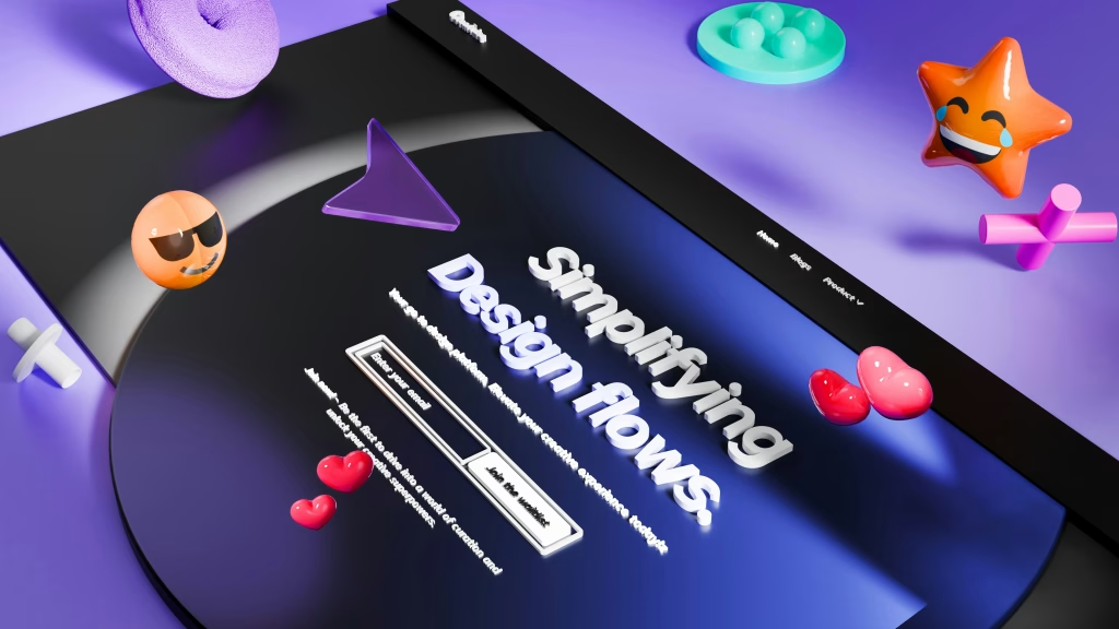
Web Design Trends in 2026: Insights from a Leading Design Agency in Brighton
# Web Design Trends in 2026: Insights from a Leading Design Agency...
Read More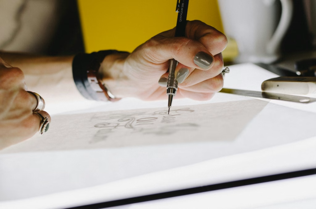
The Role of a Design Agency in Shaping Graphic Design Trends
In today’s fast-paced digital landscape, businesses must effectively communicate their brand message...
Read More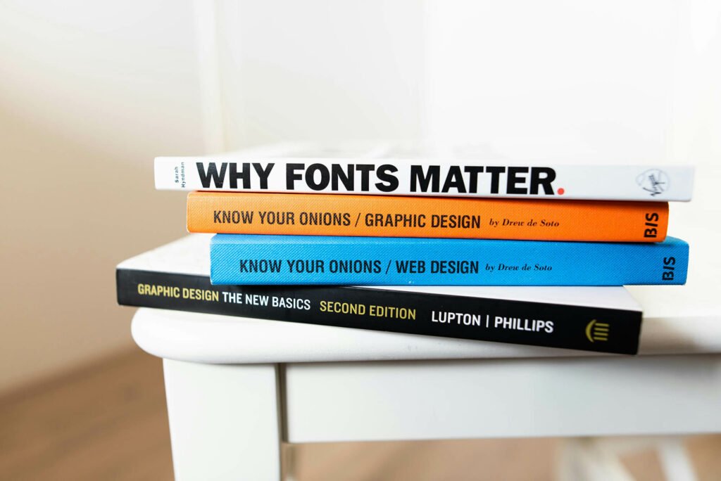
The Power of Design in Modern Business
Design is no longer just about aesthetics; it’s a critical component of...
Read More
The Importance of UX/UI Design in Elevating Your Brand
In today’s digital landscape, user experience (UX) and user interface (UI) design...
Read More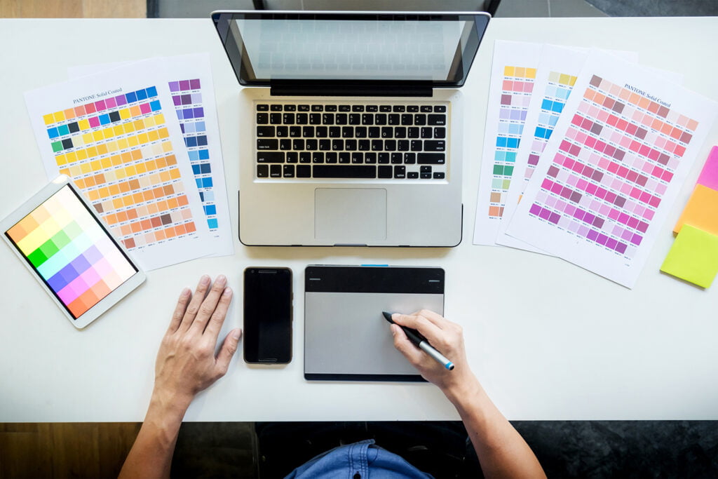
Unveiling the Artistry of Graphic Design
In a world where visual communication holds immense power, graphic design emerges...
Read More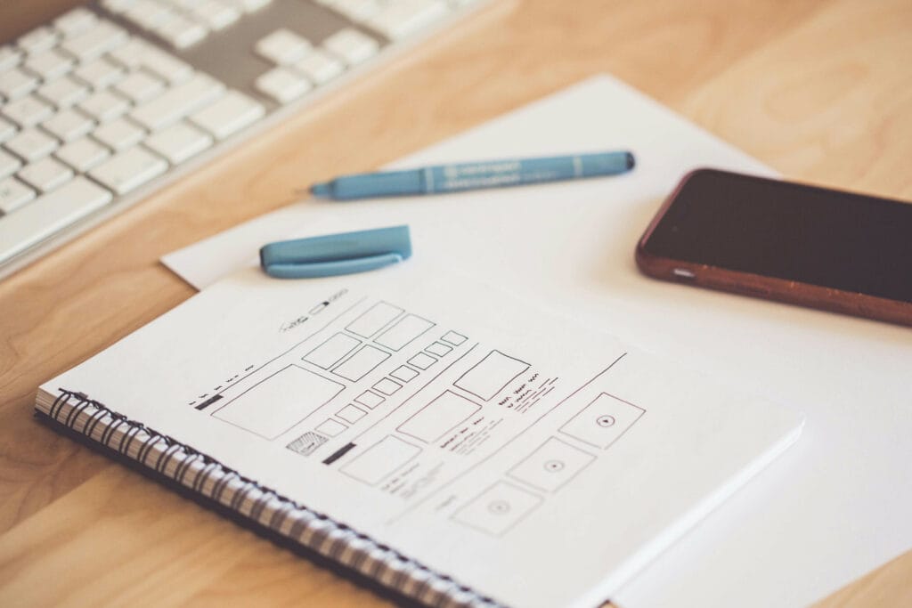
Unleashing the Power of UX/UI Design
At its core, UX/UI design is the art of crafting meaningful interactions...
Read More