- Meetings available in limited quantity! Don't delay your creative journey. Let's Create Together!
);}.button-group .button.-small.btn-optional{padding: 0 var(--clb-button-side-padding);min-height: var(--clb-button-height);}.site-footer .page-container{--clb-container-width:1568px;}.site-footer{background-color:#000000;background-image:url('https://shanefox.co.uk/wp-content/uploads/2024/08/Grid.png');background-position:center center;background-repeat:no-repeat;}.site-footer .widget-title{color:#ffffff;}.site-footer h6,.site-footer .widgets,.site-footer .scroll-top,.site-footer .color-switcher-item.dark,.site-footer .button,.site-footer input,.site-footer-copyright{color:#ffffff;}.site-footer a:not(.-unlink){color:#ffffff;}.site-footer-copyright{background-color:#0029ff;}.site-footer-copyright .holder{color:#ffffff;}.site-footer-copyright .holder a:not(.-unlink){color:#ffffff;}body.custom-cursor .circle-cursor-inner,body.custom-cursor .circle-cursor-inner.cursor-link-hover{background-color:#2afca5;}body.custom-cursor .circle-cursor-outer,body.custom-cursor .circle-cursor-outer.cursor-link-hover{border-color:#2afca5;}.header-wrap.page-container:not(.-full-w){--clb-container-width:1568px;}.header:not(.-sticky){background-color:rgba(10,10,10,0.01);}.header.-sticky:not(.header-8){background-color:#000000;}.header.-mobile:not(.-sticky) .hamburger-outer,.header.-mobile:not(.-sticky) .branding-title,.header.-mobile:not(.-sticky) .icon-button:not(.-overlay-button):not(.-small):not(.-extra-small),.header.-mobile:not(.-sticky) .cart-button-total a,.header.-mobile:not(.-sticky) .lang-dropdown{font-size:3rem;}.subheader{background-color:#0029ff;}.subheader,.subheader a{color:#ffffff;}.menu-optional .button-group .button{--clb-color-white:#ffffff;}.menu-optional .button-group .button:not(.page-link):not(.-dm-ignore){--clb-button-color:#0029ff;}.clb-popup.hamburger-nav{background-color:#0029ff;}.hamburger-nav .details-column:not(.social-networks),.hamburger-nav .details-column:not(.social-networks) b{color:#ffffff;}@media screen and (max-width: 768px) { .header,.slide-in-overlay{opacity: 0;}}.header.-mobile .nav .holder{background-color:#0029ff;}.header.-mobile .nav,.header.-mobile .slide-in-overlay .copyright,.header.-mobile .slide-in-overlay .lang-dropdown,.header.-mobile .slide-in-overlay .close-bar .icon-button:not(.-small){color:#ffffff;}.header.-mobile .slide-in-overlay .lang-dropdown{background-image: url("data:image/svg+xml,%3csvg xmlns='http://www.w3.org/2000/svg' viewBox='0 0 16 16'%3e%3cpath fill='none' stroke='%23ffffff' stroke-linecap='round' stroke-linejoin='round' stroke-width='2' d='M2 5l6 6 6-6'/%3e%3c/svg%3e");}.popup-subscribe .thumbnail{background-color:#000000;background-image:url('https://shanefox.co.uk/wp-content/uploads/2024/08/thrive-billboard.png.webp');background-size:cover;background-position:center center;background-repeat:no-repeat;}.popup-subscribe{background-color:#000000;}.clb-popup.subscribe-popup .close-bar .icon-button .icon,.clb-popup.subscribe-popup.-slide-in .close-bar .icon-button .icon{color:#ffffff;}.popup-subscribe .close-link{color:#ffffff;}.popup-subscribe .title{font-size:2.5rem;color:#ffffff;}.popup-subscribe p{color:#ffffff;}.notification .alert{color:#000000;}.notification .alert a{color:#0029ff;}:root{--clb-container-width:1568px;}.site-content,.page-headline:before{background-color:#000000;background-image:url('https://shanefox.co.uk/wp-content/uploads/2025/02/Group-19-1.png.webp');background-size:cover;background-position:center top;background-repeat:repeat-y;}.page-headline .bg-image{background-color:#0029ff;}.page-headline::after{background-color:rgba(0,41,255,0.75);}.page-headline .title{color:#ffffff;}.back-link:not(.light-typo):not(.dark-typo){color:#ffffff;}.breadcrumb,.filter-holder,.filter-holder select{color:#ffffff;}h1{font-size:4.75rem;}h2{font-size:3.5rem;}h3{font-size:2.25rem;}h4{font-size:1.5rem;}h5{font-size:1rem;}h6{font-size:.875rem;}@media screen and (max-width: 1440px) { :root { --clb-body-font-size:1rem; } } @media screen and (max-width: 1180px) { :root { --clb-body-font-size:.875rem; } } @media screen and (max-width: 768px) { :root { --clb-body-font-size:.875rem; } }@media screen and (max-width: 1440px) { :root { --clb-subtitles-font-size:1rem; } } @media screen and (max-width: 1180px) { :root { --clb-subtitles-font-size:1rem; } } @media screen and (max-width: 768px) { :root { --clb-subtitles-font-size:1rem; } }@media screen and (max-width: 1440px) { h1 { font-size:4.75rem; } } @media screen and (max-width: 1180px) { h1 { font-size:3.75rem; } } @media screen and (max-width: 768px) { h1 { font-size:3rem; } }@media screen and (max-width: 1440px) { h2 { font-size:3.5rem; } } @media screen and (max-width: 1180px) { h2 { font-size:3rem; } } @media screen and (max-width: 768px) { h2 { font-size:2.5rem; } }@media screen and (max-width: 1440px) { h3 { font-size:2.25rem; } } @media screen and (max-width: 1180px) { h3 { font-size:2rem; } } @media screen and (max-width: 768px) { h3 { font-size:1.75rem; } }@media screen and (max-width: 1440px) { h4 { font-size:1.5rem; } } @media screen and (max-width: 1180px) { h4 { font-size:1.25rem; } } @media screen and (max-width: 768px) { h4 { font-size:1.25rem; } }@media screen and (max-width: 1440px) { h5 { font-size:1rem; } } @media screen and (max-width: 1180px) { h5 { font-size:.875rem; } } @media screen and (max-width: 768px) { h5 { font-size:.875rem; } }@media screen and (max-width: 1440px) { h6 { font-size:.875rem; } } @media screen and (max-width: 1180px) { h6 { font-size:.875ren; } } @media screen and (max-width: 768px) { h6 { font-size:.875rem; } }.blog-item .meta-holder{color:#ffffff;}.blog-item .date{color:#2afca5;}.blog-item .post-meta-estimate{color:#ffffff;}.blog-item .title a{color:#ffffff;}.blog-item p{color:#ffffff;}.blog-item .category-holder{color:#ffffff;}.blog-item .button.-text{color:#ffffff;} @media screen and (min-width:1181px){.header-wrap .button-group{margin-right: 20px;}.blog-posts .vc_col-lg-4:last-child,.related-posts .vc_col-lg-4:last-child{display: none;}.img-shadow{filter: drop-shadow(0 0 120px rgba(0,41,255,0.75));-webkit-filter: drop-shadow(0 0 120px rgba(0,41,255,0.75));}.header:not(.-mobile) .menu li > ul{background-color: #000;border-top-width: 0px !important;border: 1px solid #333333;border-radius: 0px 0px 1.25rem 1.25rem !important;display: grid;grid-template-columns: repeat(2, 1fr);gap: .25rem;padding: .5rem !important;margin: 1rem !important;width: max(628px, 60vw);max-width: 800px;}.menu-depth-1.sub-menu .sub-menu-title{font-size: clamp(0.875rem, 0.176rem + 1.4563vw, 1.25rem);}.mega-menu-item.sub-nav-item.menu-item-depth-1 a> span{display: flex;flex-direction: row;flex-wrap: wrap;align-items: center;justify-content: flex-start;gap: .5rem;padding: 1rem;}.mega-menu-item.sub-nav-item.menu-item-depth-1 a{border: 1px solid transparent;border-radius: 1rem !important;transition: all 0.2s ease-out;}.mega-menu-item.sub-nav-item.menu-item-depth-1 a:hover{border-color: #333333;background-color: rgba(255,255,255,.02) !important;transition: all 0.2s ease-in;}.hamburger-nav-holder .mega-menu-item.sub-nav-item.menu-item-depth-1 a:hover{border: none;background-color: transparent !important;}.hamburger-nav-holder .mega-menu-item.sub-nav-item.menu-item-depth-1 a{border: none;background-color: transparent !important;}.mega-menu-item.sub-nav-item.menu-item-depth-1 a span *{order: 2;}.mega-menu-item.sub-nav-item.menu-item-depth-1 a span .custom-icon{order: 1;width: 40px;height: 40px;}.mega-menu-item.sub-nav-item.menu-item-depth-1 a span .custom-text{order: 3;font-size: clamp(0.75rem, 0.176rem + 1vw, 0.875rem); color: rgba(150,150,150,1);font-weight: 400;}body:has(.nav-item.has-submenu:hover):before{opacity: 1;z-index: 3;transition: all .2s ease-out;}body:has(.nav-item.has-submenu:hover) .header:not(.-sticky){background-color: #000;}body:has(.nav-item.has-submenu):before{content: '';height: 100vh;width: 100vw;position: fixed;z-index: -1;background-color: rgba(0,0,0,0.5);opacity: 0;backdrop-filter: blur(20px);-webkit-backdrop-filter: blur(20px);transition: all .2s ease-out;}.header:not(.-mobile) .menu li .menu-chevron{margin-left:.25rem;}.with-sticky-footer .site-footer {z-index: 0;}.site-footer .branding .logo img{min-height:40px; height:40px;}.header .branding .logo img,.header .branding .logo-mobile img,.header .branding .logo-sticky-mobile img,.header .branding .logo-dynamic img{min-height:50px; height:50px;}.header.-sticky .branding .logo img,.header.-sticky .branding .logo-mobile img,.header.-sticky .branding .logo-sticky img,.header.-sticky .branding .logo-sticky-mobile img,.header.-sticky .branding .logo-dynamic img{min-height:50px; height:50px;}:root{--clb-header-height:74px;}.header.-sticky:not(.-fixed):not(.header-8) .header-wrap{height:74px;}:root{--clb-subheader-height:20px;}.popup-subscribe{width:860px;}.page-headline{min-height:100px;}} @media screen and (min-width:769px) and (max-width:1180px){.header-wrap .button-group{margin-right: 20px;}.center-title-mob .elementor-widget-container .ohio-widget.heading.-left{display:flex;flex-direction: column;justify-content: center;align-items: center;text-align: center;}.mega-menu-item.sub-nav-item.menu-item-depth-1 a> span{display: flex;flex-direction: row;flex-wrap: wrap;align-items: center;justify-content: flex-start;gap: .5rem;padding: 1rem;}.header.-mobile .menu>.nav-item a:hover{color:#2AFCA5;transition: all var(--clb-transition-function) var(--clb-transition-duration);}.header.-mobile .menu>.nav-item a{transition: all var(--clb-transition-function) var(--clb-transition-duration);}.page-headline.subheader_included.-left{padding-bottom: 1.25rem;}.filter-holder .mobile-overlay .holder{background-color: var(--clb-fill-color) !important;}.filter-holder .mobile-overlay .holder .filter .-small{filter: brightness(200);}.img-shadow{filter: drop-shadow(0 0 80px rgba(0,41,255,0.75));-webkit-filter: drop-shadow(0 0 80px rgba(0,41,255,0.75));}div.page-headline.-full-vh {height: auto;}.type-post .entry-content{padding-top: 3rem;}.elementor-widget .ohio-widget .clb-slider-item {padding-left: 0px !important;padding-right: 0px !important;}.-sticky-element{position: initial !important;}.blog-posts-classic{grid-template-columns: repeat(2, 1fr);}.header:not(.-mobile) .menu li > ul{background-color: #000;border-top-width: 0px !important;border: 1px solid #333333;border-radius: 0px 0px 1.25rem 1.25rem !important;display: grid;grid-template-columns: repeat(2, 1fr);gap: .25rem;padding: .5rem !important;margin: 1rem !important;width: max(628px, 60vw);max-width: 800px;}.menu-depth-1.sub-menu .sub-menu-title{font-size: clamp(0.875rem, 0.176rem + 1.4563vw, 1.25rem);}.mega-menu-item.sub-nav-item.menu-item-depth-1 a> span{display: flex;flex-direction: row;flex-wrap: wrap;align-items: center;gap: .5rem;padding: 1rem;}.mega-menu-item.sub-nav-item.menu-item-depth-1 a{border: 1px solid transparent;border-radius: 1rem !important;}.mega-menu-item.sub-nav-item.menu-item-depth-1 a:hover{border-color: #333333;background-color: rgba(255,255,255,.05) !important}.mega-menu-item.sub-nav-item.menu-item-depth-1 a span *{order: 2;}.mega-menu-item.sub-nav-item.menu-item-depth-1 a span .custom-icon{order: 1;width: 40px;height: 40px;}.mega-menu-item.sub-nav-item.menu-item-depth-1 a span .custom-text{order: 3;font-size: clamp(0.75rem, 0.176rem + 1vw, 0.875rem); color: rgba(150,150,150,1);font-weight: 400;}body:has(.nav-item.has-submenu:hover):before{opacity: 1;transition: all .2s ease-out;}body:has(.nav-item.has-submenu):before{content: '';height: 100vh;width: 100vw;position: absolute;z-index: 3;background-color: rgba(0,0,0,0.5);backdrop-filter: blur(20px);-webkit-backdrop-filter: blur(20px);opacity: 0;transition: all .2s ease-out;}.slide-in .slide-in-overlay .holder, .is-mobile-menu .slide-in-overlay .holder{display: flex;flex-direction: column;justify-content: space-between;height: 100dvh;}.header.-mobile .slide-in-overlay .copyright a{font-size: .875rem !important;line-height: 1px !important;margin-bottom: 12px !important;}.header.-mobile .slide-in-overlay .copyright{line-height: 1rem !important;}.header.-mobile .slide-in-overlay .copyright h5{margin-top: 1rem;}.header.-mobile .menu li.active > a{background-color: transparent !important;color:var(--e-global-color-accent) !important;}#mobile-menu .sub-menu-title{font-size: 2rem !important;}.slide-in .slide-in-overlay .holder, .is-mobile-menu .slide-in-overlay .holder{background-color: var(--clb-selection-color);}.site-footer .branding .logo img{min-height:30px; height:30px;}.header .branding .logo img,.header .branding .logo-mobile img,.header .branding .logo-sticky-mobile img,.header .branding .logo-dynamic img{min-height:50px; height:50px;}.header.-sticky .branding .logo img,.header.-sticky .branding .logo-mobile img,.header.-sticky .branding .logo-sticky img,.header.-sticky .branding .logo-sticky-mobile img,.header.-sticky .branding .logo-dynamic img{min-height:50px; height:50px;}:root{--clb-header-height:74px;}.header.-sticky:not(.-fixed):not(.header-8) .header-wrap{height:74px;}:root{--clb-subheader-height:20px;}.page-headline{min-height:80px;}} @media screen and (max-width:768px){.header-wrap .button-group .button:not(.-outlined){display: none;}.subheader ul, .subheader ul li {flex-direction: column;}.center-title-mob .elementor-widget-container .ohio-widget.heading.-left{display:flex;flex-direction: column;justify-content: center;align-items: center;text-align: center;}.header.-mobile .menu>.nav-item a:hover{color:#2AFCA5;transition: all var(--clb-transition-function) var(--clb-transition-duration);}.header.-mobile .menu>.nav-item a{transition: all var(--clb-transition-function) var(--clb-transition-duration);}.page-headline.subheader_included.-left{padding-bottom: 1.25rem;}.is-mobile-menu .mobile-overlay .holder{display: flex;flex-direction: column;justify-content: space-between;height: 100dvh;}.filter-holder .mobile-overlay .holder{background-color: var(--clb-fill-color) !important;}.filter-holder .mobile-overlay .holder .filter .-small{filter: brightness(200);}.img-shadow{filter: drop-shadow(0 0 60px rgba(0,41,255,0.75));-webkit-filter: drop-shadow(0 0 60px rgba(0,41,255,0.75));}div.page-headline.-full-vh {height: auto;}.type-post .entry-content{padding-top: 2rem;}.elementor-widget .ohio-widget .clb-slider-item {padding-left: 0px !important;padding-right: 0px !important;}.-sticky-element{position: initial !important;}.blog-posts-classic{grid-template-columns: repeat(1, 1fr);}.mega-menu-item.sub-nav-item.menu-item-depth-1 a span .custom-icon,.mega-menu-item.sub-nav-item.menu-item-depth-1 a span .custom-text{display: none;}.slide-in .slide-in-overlay .holder, .is-mobile-menu .slide-in-overlay .holder{display: flex;flex-direction: column;justify-content: space-between;height: 100dvh;}.header.-mobile .slide-in-overlay .copyright a{font-size: .875rem !important;line-height: 1px !important;margin-bottom: 12px !important;}.header.-mobile .slide-in-overlay .copyright{line-height: 1rem !important;}.header.-mobile .slide-in-overlay .copyright h5{margin-top: 1rem;}.header.-mobile .menu li.active > a{background-color: transparent !important;color:var(--e-global-color-accent) !important;}#mobile-menu .sub-menu-title{font-size: 2rem !important;}.slide-in .slide-in-overlay .holder, .is-mobile-menu .slide-in-overlay .holder{background-color: var(--clb-selection-color);}body:has(.page-headline) .site-content{background-position: 0px 180px !important;}body:has(.page-headline) .header:not(.-sticky){background-color: rgba(0,0,0,1);}.site-footer .branding .logo img{min-height:30px; height:30px;}.header .branding .logo img,.header .branding .logo-mobile img,.header .branding .logo-sticky-mobile img,.header .branding .logo-dynamic img{min-height:50px; height:50px;}.header.-sticky .branding .logo img,.header.-sticky .branding .logo-mobile img,.header.-sticky .branding .logo-sticky img,.header.-sticky .branding .logo-sticky-mobile img,.header.-sticky .branding .logo-dynamic img{min-height:50px; height:50px;}:root{--clb-header-height:74px;}.header.-sticky:not(.-fixed):not(.header-8) .header-wrap{height:74px;}:root{--clb-subheader-height:20px;}.page-headline{min-height:60px;}}
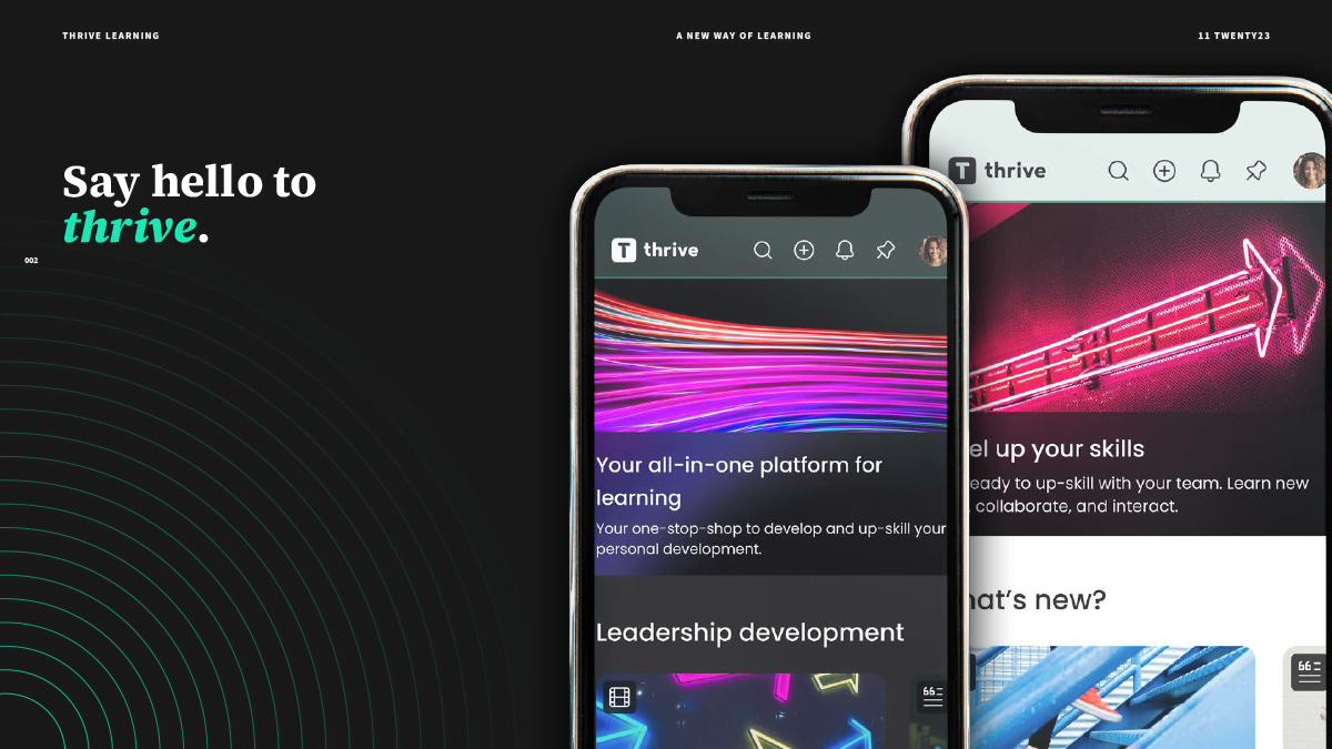
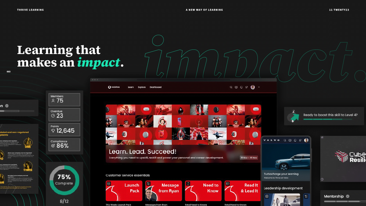
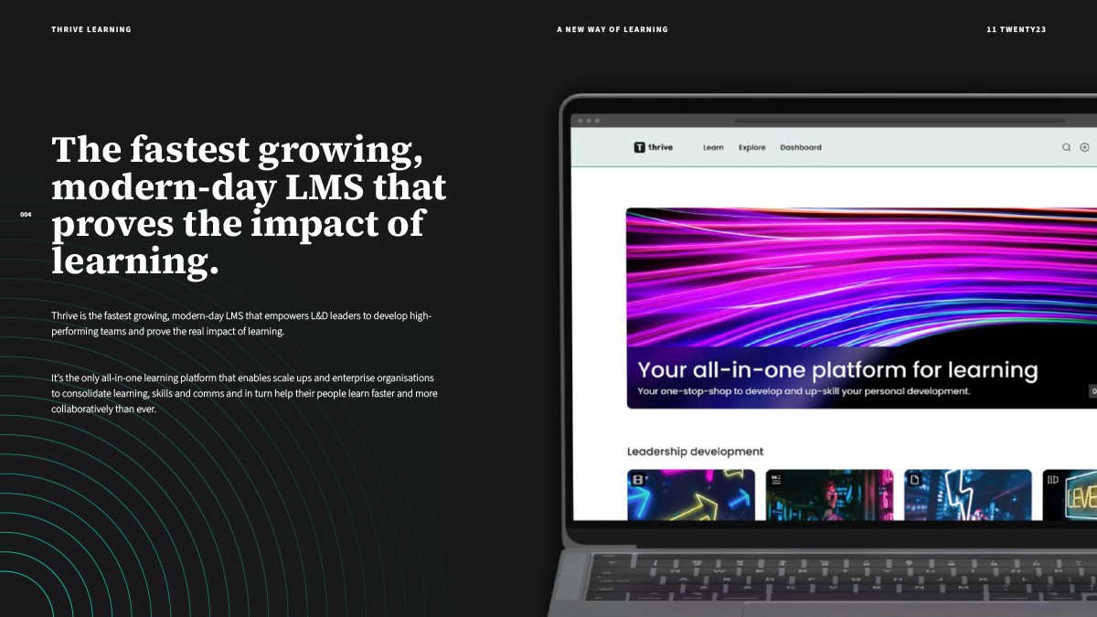
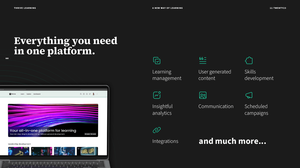
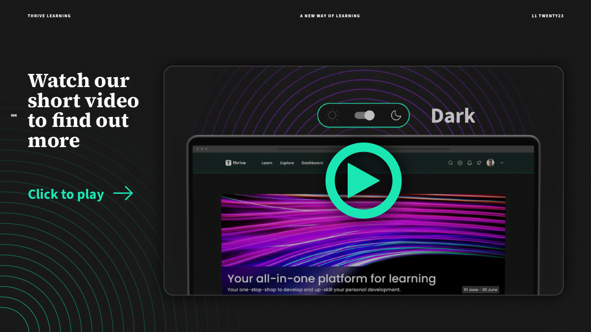
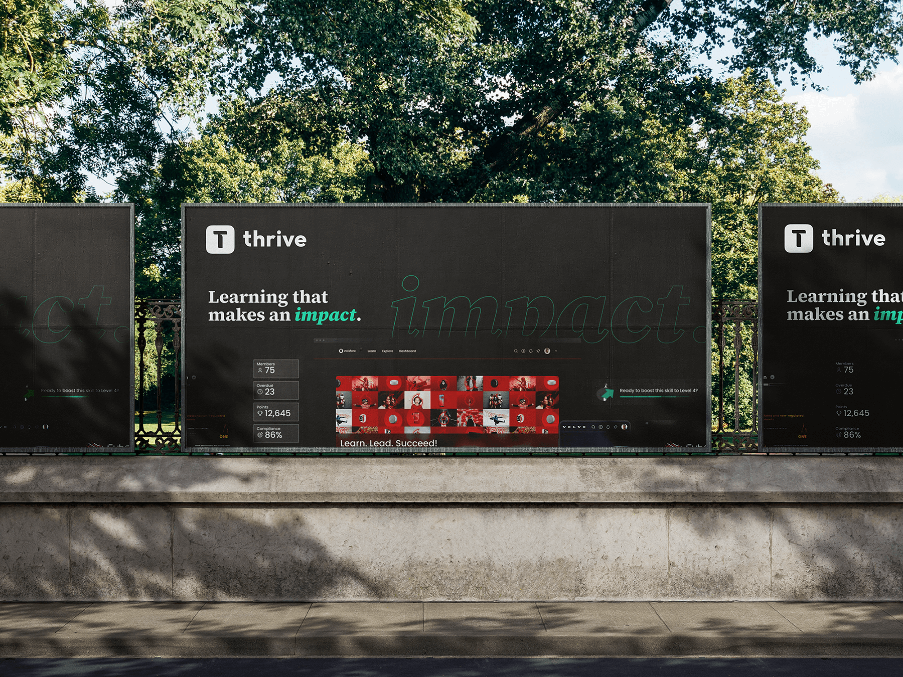
Thrive is the fastest-growing, all-in-one, AI-powered Learning Management System (LMS) in the EdTech industry. They approached us to elevate their digital presence and user experience through cutting-edge UX/UI design, engaging motion design, and cohesive art direction. The goal was to create a seamless, visually striking, and user-friendly platform that would cater to the diverse needs of educational institutions, corporate training programs, and individual learners.
Enhance the user experience (UX) to improve engagement and retention.
Develop an intuitive and visually appealing user interface (UI) that reflects the brand’s innovative AI capabilities.
Incorporate dynamic motion design to create a more interactive and engaging learning environment.
Establish a unified art direction that aligns with the brand’s identity and resonates with its target audience.
Our work with Thrive in UX/UI design, motion design, and art direction resulted in a transformative digital experience that not only met but exceeded the client’s expectations. The platform's enhanced usability, coupled with visually engaging design, solidified Thrive's position as a leader in the AI-powered LMS market, driving significant growth and user satisfaction.