- Meetings available in limited quantity! Don't delay your creative journey. Let's Create Together!
);}.button-group .button.-small.btn-optional{padding: 0 var(--clb-button-side-padding);min-height: var(--clb-button-height);}.site-footer .page-container{--clb-container-width:1568px;}.site-footer{background-color:#000000;background-image:url('https://shanefox.co.uk/wp-content/uploads/2024/08/Grid.png');background-position:center center;background-repeat:no-repeat;}.site-footer .widget-title{color:#ffffff;}.site-footer h6,.site-footer .widgets,.site-footer .scroll-top,.site-footer .color-switcher-item.dark,.site-footer .button,.site-footer input,.site-footer-copyright{color:#ffffff;}.site-footer a:not(.-unlink){color:#ffffff;}.site-footer-copyright{background-color:#0029ff;}.site-footer-copyright .holder{color:#ffffff;}.site-footer-copyright .holder a:not(.-unlink){color:#ffffff;}body.custom-cursor .circle-cursor-inner,body.custom-cursor .circle-cursor-inner.cursor-link-hover{background-color:#2afca5;}body.custom-cursor .circle-cursor-outer,body.custom-cursor .circle-cursor-outer.cursor-link-hover{border-color:#2afca5;}.header-wrap.page-container:not(.-full-w){--clb-container-width:1568px;}.header:not(.-sticky){background-color:rgba(10,10,10,0.01);}.header.-sticky:not(.header-8){background-color:#000000;}.header.-mobile:not(.-sticky) .hamburger-outer,.header.-mobile:not(.-sticky) .branding-title,.header.-mobile:not(.-sticky) .icon-button:not(.-overlay-button):not(.-small):not(.-extra-small),.header.-mobile:not(.-sticky) .cart-button-total a,.header.-mobile:not(.-sticky) .lang-dropdown{font-size:3rem;}.subheader{background-color:#0029ff;}.subheader,.subheader a{color:#ffffff;}.menu-optional .button-group .button{--clb-color-white:#ffffff;}.menu-optional .button-group .button:not(.page-link):not(.-dm-ignore){--clb-button-color:#0029ff;}.clb-popup.hamburger-nav{background-color:#0029ff;}.hamburger-nav .details-column:not(.social-networks),.hamburger-nav .details-column:not(.social-networks) b{color:#ffffff;}@media screen and (max-width: 768px) { .header,.slide-in-overlay{opacity: 0;}}.header.-mobile .nav .holder{background-color:#0029ff;}.header.-mobile .nav,.header.-mobile .slide-in-overlay .copyright,.header.-mobile .slide-in-overlay .lang-dropdown,.header.-mobile .slide-in-overlay .close-bar .icon-button:not(.-small){color:#ffffff;}.header.-mobile .slide-in-overlay .lang-dropdown{background-image: url("data:image/svg+xml,%3csvg xmlns='http://www.w3.org/2000/svg' viewBox='0 0 16 16'%3e%3cpath fill='none' stroke='%23ffffff' stroke-linecap='round' stroke-linejoin='round' stroke-width='2' d='M2 5l6 6 6-6'/%3e%3c/svg%3e");}.popup-subscribe .thumbnail{background-color:#000000;background-image:url('https://shanefox.co.uk/wp-content/uploads/2024/08/thrive-billboard.png.webp');background-size:cover;background-position:center center;background-repeat:no-repeat;}.popup-subscribe{background-color:#000000;}.clb-popup.subscribe-popup .close-bar .icon-button .icon,.clb-popup.subscribe-popup.-slide-in .close-bar .icon-button .icon{color:#ffffff;}.popup-subscribe .close-link{color:#ffffff;}.popup-subscribe .title{font-size:2.5rem;color:#ffffff;}.popup-subscribe p{color:#ffffff;}.notification .alert{color:#000000;}.notification .alert a{color:#0029ff;}:root{--clb-container-width:1568px;}.site-content,.page-headline:before{background-color:#000000;background-image:url('https://shanefox.co.uk/wp-content/uploads/2025/02/Group-19-1.png.webp');background-size:cover;background-position:center top;background-repeat:repeat-y;}.page-headline .bg-image{background-color:#0029ff;}.page-headline::after{background-color:rgba(0,41,255,0.75);}.page-headline .title{color:#ffffff;}.back-link:not(.light-typo):not(.dark-typo){color:#ffffff;}.breadcrumb,.filter-holder,.filter-holder select{color:#ffffff;}h1{font-size:4.75rem;}h2{font-size:3.5rem;}h3{font-size:2.25rem;}h4{font-size:1.5rem;}h5{font-size:1rem;}h6{font-size:.875rem;}@media screen and (max-width: 1440px) { :root { --clb-body-font-size:1rem; } } @media screen and (max-width: 1180px) { :root { --clb-body-font-size:.875rem; } } @media screen and (max-width: 768px) { :root { --clb-body-font-size:.875rem; } }@media screen and (max-width: 1440px) { :root { --clb-subtitles-font-size:1rem; } } @media screen and (max-width: 1180px) { :root { --clb-subtitles-font-size:1rem; } } @media screen and (max-width: 768px) { :root { --clb-subtitles-font-size:1rem; } }@media screen and (max-width: 1440px) { h1 { font-size:4.75rem; } } @media screen and (max-width: 1180px) { h1 { font-size:3.75rem; } } @media screen and (max-width: 768px) { h1 { font-size:3rem; } }@media screen and (max-width: 1440px) { h2 { font-size:3.5rem; } } @media screen and (max-width: 1180px) { h2 { font-size:3rem; } } @media screen and (max-width: 768px) { h2 { font-size:2.5rem; } }@media screen and (max-width: 1440px) { h3 { font-size:2.25rem; } } @media screen and (max-width: 1180px) { h3 { font-size:2rem; } } @media screen and (max-width: 768px) { h3 { font-size:1.75rem; } }@media screen and (max-width: 1440px) { h4 { font-size:1.5rem; } } @media screen and (max-width: 1180px) { h4 { font-size:1.25rem; } } @media screen and (max-width: 768px) { h4 { font-size:1.25rem; } }@media screen and (max-width: 1440px) { h5 { font-size:1rem; } } @media screen and (max-width: 1180px) { h5 { font-size:.875rem; } } @media screen and (max-width: 768px) { h5 { font-size:.875rem; } }@media screen and (max-width: 1440px) { h6 { font-size:.875rem; } } @media screen and (max-width: 1180px) { h6 { font-size:.875ren; } } @media screen and (max-width: 768px) { h6 { font-size:.875rem; } }.blog-item .meta-holder{color:#ffffff;}.blog-item .date{color:#2afca5;}.blog-item .post-meta-estimate{color:#ffffff;}.blog-item .title a{color:#ffffff;}.blog-item p{color:#ffffff;}.blog-item .category-holder{color:#ffffff;}.blog-item .button.-text{color:#ffffff;} @media screen and (min-width:1181px){.header-wrap .button-group{margin-right: 20px;}.blog-posts .vc_col-lg-4:last-child,.related-posts .vc_col-lg-4:last-child{display: none;}.img-shadow{filter: drop-shadow(0 0 120px rgba(0,41,255,0.75));-webkit-filter: drop-shadow(0 0 120px rgba(0,41,255,0.75));}.header:not(.-mobile) .menu li > ul{background-color: #000;border-top-width: 0px !important;border: 1px solid #333333;border-radius: 0px 0px 1.25rem 1.25rem !important;display: grid;grid-template-columns: repeat(2, 1fr);gap: .25rem;padding: .5rem !important;margin: 1rem !important;width: max(628px, 60vw);max-width: 800px;}.menu-depth-1.sub-menu .sub-menu-title{font-size: clamp(0.875rem, 0.176rem + 1.4563vw, 1.25rem);}.mega-menu-item.sub-nav-item.menu-item-depth-1 a> span{display: flex;flex-direction: row;flex-wrap: wrap;align-items: center;justify-content: flex-start;gap: .5rem;padding: 1rem;}.mega-menu-item.sub-nav-item.menu-item-depth-1 a{border: 1px solid transparent;border-radius: 1rem !important;transition: all 0.2s ease-out;}.mega-menu-item.sub-nav-item.menu-item-depth-1 a:hover{border-color: #333333;background-color: rgba(255,255,255,.02) !important;transition: all 0.2s ease-in;}.hamburger-nav-holder .mega-menu-item.sub-nav-item.menu-item-depth-1 a:hover{border: none;background-color: transparent !important;}.hamburger-nav-holder .mega-menu-item.sub-nav-item.menu-item-depth-1 a{border: none;background-color: transparent !important;}.mega-menu-item.sub-nav-item.menu-item-depth-1 a span *{order: 2;}.mega-menu-item.sub-nav-item.menu-item-depth-1 a span .custom-icon{order: 1;width: 40px;height: 40px;}.mega-menu-item.sub-nav-item.menu-item-depth-1 a span .custom-text{order: 3;font-size: clamp(0.75rem, 0.176rem + 1vw, 0.875rem); color: rgba(150,150,150,1);font-weight: 400;}body:has(.nav-item.has-submenu:hover):before{opacity: 1;z-index: 3;transition: all .2s ease-out;}body:has(.nav-item.has-submenu:hover) .header:not(.-sticky){background-color: #000;}body:has(.nav-item.has-submenu):before{content: '';height: 100vh;width: 100vw;position: fixed;z-index: -1;background-color: rgba(0,0,0,0.5);opacity: 0;backdrop-filter: blur(20px);-webkit-backdrop-filter: blur(20px);transition: all .2s ease-out;}.header:not(.-mobile) .menu li .menu-chevron{margin-left:.25rem;}.with-sticky-footer .site-footer {z-index: 0;}.site-footer .branding .logo img{min-height:40px; height:40px;}.header .branding .logo img,.header .branding .logo-mobile img,.header .branding .logo-sticky-mobile img,.header .branding .logo-dynamic img{min-height:50px; height:50px;}.header.-sticky .branding .logo img,.header.-sticky .branding .logo-mobile img,.header.-sticky .branding .logo-sticky img,.header.-sticky .branding .logo-sticky-mobile img,.header.-sticky .branding .logo-dynamic img{min-height:50px; height:50px;}:root{--clb-header-height:74px;}.header.-sticky:not(.-fixed):not(.header-8) .header-wrap{height:74px;}:root{--clb-subheader-height:20px;}.popup-subscribe{width:860px;}.page-headline{min-height:100px;}} @media screen and (min-width:769px) and (max-width:1180px){.header-wrap .button-group{margin-right: 20px;}.center-title-mob .elementor-widget-container .ohio-widget.heading.-left{display:flex;flex-direction: column;justify-content: center;align-items: center;text-align: center;}.mega-menu-item.sub-nav-item.menu-item-depth-1 a> span{display: flex;flex-direction: row;flex-wrap: wrap;align-items: center;justify-content: flex-start;gap: .5rem;padding: 1rem;}.header.-mobile .menu>.nav-item a:hover{color:#2AFCA5;transition: all var(--clb-transition-function) var(--clb-transition-duration);}.header.-mobile .menu>.nav-item a{transition: all var(--clb-transition-function) var(--clb-transition-duration);}.page-headline.subheader_included.-left{padding-bottom: 1.25rem;}.filter-holder .mobile-overlay .holder{background-color: var(--clb-fill-color) !important;}.filter-holder .mobile-overlay .holder .filter .-small{filter: brightness(200);}.img-shadow{filter: drop-shadow(0 0 80px rgba(0,41,255,0.75));-webkit-filter: drop-shadow(0 0 80px rgba(0,41,255,0.75));}div.page-headline.-full-vh {height: auto;}.type-post .entry-content{padding-top: 3rem;}.elementor-widget .ohio-widget .clb-slider-item {padding-left: 0px !important;padding-right: 0px !important;}.-sticky-element{position: initial !important;}.blog-posts-classic{grid-template-columns: repeat(2, 1fr);}.header:not(.-mobile) .menu li > ul{background-color: #000;border-top-width: 0px !important;border: 1px solid #333333;border-radius: 0px 0px 1.25rem 1.25rem !important;display: grid;grid-template-columns: repeat(2, 1fr);gap: .25rem;padding: .5rem !important;margin: 1rem !important;width: max(628px, 60vw);max-width: 800px;}.menu-depth-1.sub-menu .sub-menu-title{font-size: clamp(0.875rem, 0.176rem + 1.4563vw, 1.25rem);}.mega-menu-item.sub-nav-item.menu-item-depth-1 a> span{display: flex;flex-direction: row;flex-wrap: wrap;align-items: center;gap: .5rem;padding: 1rem;}.mega-menu-item.sub-nav-item.menu-item-depth-1 a{border: 1px solid transparent;border-radius: 1rem !important;}.mega-menu-item.sub-nav-item.menu-item-depth-1 a:hover{border-color: #333333;background-color: rgba(255,255,255,.05) !important}.mega-menu-item.sub-nav-item.menu-item-depth-1 a span *{order: 2;}.mega-menu-item.sub-nav-item.menu-item-depth-1 a span .custom-icon{order: 1;width: 40px;height: 40px;}.mega-menu-item.sub-nav-item.menu-item-depth-1 a span .custom-text{order: 3;font-size: clamp(0.75rem, 0.176rem + 1vw, 0.875rem); color: rgba(150,150,150,1);font-weight: 400;}body:has(.nav-item.has-submenu:hover):before{opacity: 1;transition: all .2s ease-out;}body:has(.nav-item.has-submenu):before{content: '';height: 100vh;width: 100vw;position: absolute;z-index: 3;background-color: rgba(0,0,0,0.5);backdrop-filter: blur(20px);-webkit-backdrop-filter: blur(20px);opacity: 0;transition: all .2s ease-out;}.slide-in .slide-in-overlay .holder, .is-mobile-menu .slide-in-overlay .holder{display: flex;flex-direction: column;justify-content: space-between;height: 100dvh;}.header.-mobile .slide-in-overlay .copyright a{font-size: .875rem !important;line-height: 1px !important;margin-bottom: 12px !important;}.header.-mobile .slide-in-overlay .copyright{line-height: 1rem !important;}.header.-mobile .slide-in-overlay .copyright h5{margin-top: 1rem;}.header.-mobile .menu li.active > a{background-color: transparent !important;color:var(--e-global-color-accent) !important;}#mobile-menu .sub-menu-title{font-size: 2rem !important;}.slide-in .slide-in-overlay .holder, .is-mobile-menu .slide-in-overlay .holder{background-color: var(--clb-selection-color);}.site-footer .branding .logo img{min-height:30px; height:30px;}.header .branding .logo img,.header .branding .logo-mobile img,.header .branding .logo-sticky-mobile img,.header .branding .logo-dynamic img{min-height:50px; height:50px;}.header.-sticky .branding .logo img,.header.-sticky .branding .logo-mobile img,.header.-sticky .branding .logo-sticky img,.header.-sticky .branding .logo-sticky-mobile img,.header.-sticky .branding .logo-dynamic img{min-height:50px; height:50px;}:root{--clb-header-height:74px;}.header.-sticky:not(.-fixed):not(.header-8) .header-wrap{height:74px;}:root{--clb-subheader-height:20px;}.page-headline{min-height:80px;}} @media screen and (max-width:768px){.header-wrap .button-group .button:not(.-outlined){display: none;}.subheader ul, .subheader ul li {flex-direction: column;}.center-title-mob .elementor-widget-container .ohio-widget.heading.-left{display:flex;flex-direction: column;justify-content: center;align-items: center;text-align: center;}.header.-mobile .menu>.nav-item a:hover{color:#2AFCA5;transition: all var(--clb-transition-function) var(--clb-transition-duration);}.header.-mobile .menu>.nav-item a{transition: all var(--clb-transition-function) var(--clb-transition-duration);}.page-headline.subheader_included.-left{padding-bottom: 1.25rem;}.is-mobile-menu .mobile-overlay .holder{display: flex;flex-direction: column;justify-content: space-between;height: 100dvh;}.filter-holder .mobile-overlay .holder{background-color: var(--clb-fill-color) !important;}.filter-holder .mobile-overlay .holder .filter .-small{filter: brightness(200);}.img-shadow{filter: drop-shadow(0 0 60px rgba(0,41,255,0.75));-webkit-filter: drop-shadow(0 0 60px rgba(0,41,255,0.75));}div.page-headline.-full-vh {height: auto;}.type-post .entry-content{padding-top: 2rem;}.elementor-widget .ohio-widget .clb-slider-item {padding-left: 0px !important;padding-right: 0px !important;}.-sticky-element{position: initial !important;}.blog-posts-classic{grid-template-columns: repeat(1, 1fr);}.mega-menu-item.sub-nav-item.menu-item-depth-1 a span .custom-icon,.mega-menu-item.sub-nav-item.menu-item-depth-1 a span .custom-text{display: none;}.slide-in .slide-in-overlay .holder, .is-mobile-menu .slide-in-overlay .holder{display: flex;flex-direction: column;justify-content: space-between;height: 100dvh;}.header.-mobile .slide-in-overlay .copyright a{font-size: .875rem !important;line-height: 1px !important;margin-bottom: 12px !important;}.header.-mobile .slide-in-overlay .copyright{line-height: 1rem !important;}.header.-mobile .slide-in-overlay .copyright h5{margin-top: 1rem;}.header.-mobile .menu li.active > a{background-color: transparent !important;color:var(--e-global-color-accent) !important;}#mobile-menu .sub-menu-title{font-size: 2rem !important;}.slide-in .slide-in-overlay .holder, .is-mobile-menu .slide-in-overlay .holder{background-color: var(--clb-selection-color);}body:has(.page-headline) .site-content{background-position: 0px 180px !important;}body:has(.page-headline) .header:not(.-sticky){background-color: rgba(0,0,0,1);}.site-footer .branding .logo img{min-height:30px; height:30px;}.header .branding .logo img,.header .branding .logo-mobile img,.header .branding .logo-sticky-mobile img,.header .branding .logo-dynamic img{min-height:50px; height:50px;}.header.-sticky .branding .logo img,.header.-sticky .branding .logo-mobile img,.header.-sticky .branding .logo-sticky img,.header.-sticky .branding .logo-sticky-mobile img,.header.-sticky .branding .logo-dynamic img{min-height:50px; height:50px;}:root{--clb-header-height:74px;}.header.-sticky:not(.-fixed):not(.header-8) .header-wrap{height:74px;}:root{--clb-subheader-height:20px;}.page-headline{min-height:60px;}}
Pourr Coffee, a premium coffee brand focused on delivering exceptional quality and flavor, engaged us to create a distinct brand identity and a high-end digital experience that would resonate with their target audience. The challenge was to design a brand and user experience that reflects the company’s commitment to quality, sustainability, and sophistication, while catering to coffee enthusiasts and discerning consumers. Our task included developing a fresh brand identity, an intuitive and upscale website design, integrating SEO content, and crafting product and packaging designs that would position Pourr Coffee as a leader in the competitive coffee market.
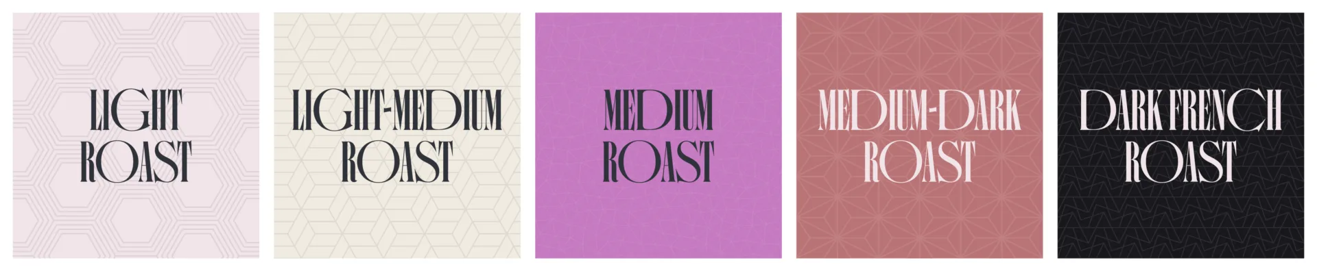
Create a new brand identity targeting a specific demographic of high-end coffee consumers, highlighting the brand’s commitment to premium quality and sustainability.
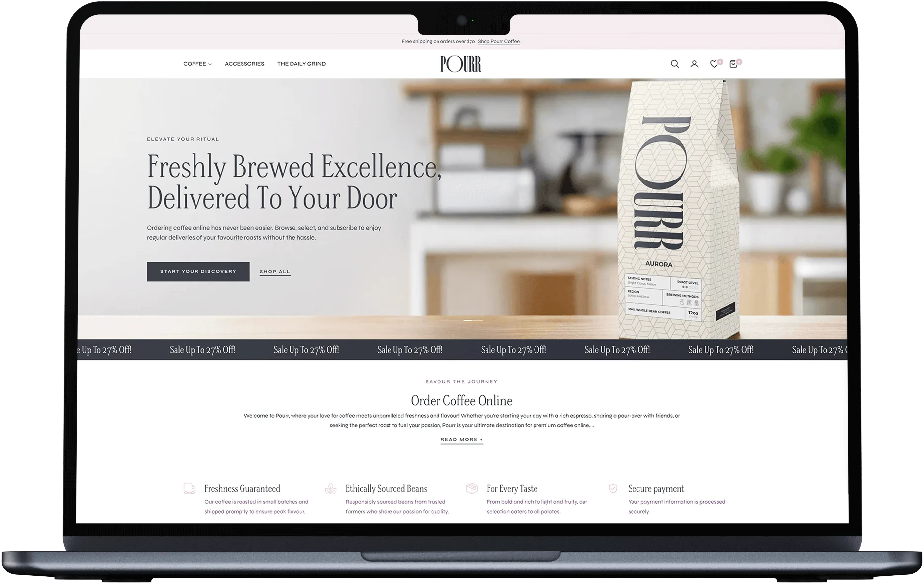
Design a new web interface that offers a seamless, high-end user experience, making it easy for customers to explore the brand’s offerings and engage with the website.
Integrate SEO-driven content to optimize the website for competitive keywords and improve search engine ranking, ensuring visibility in a crowded market.
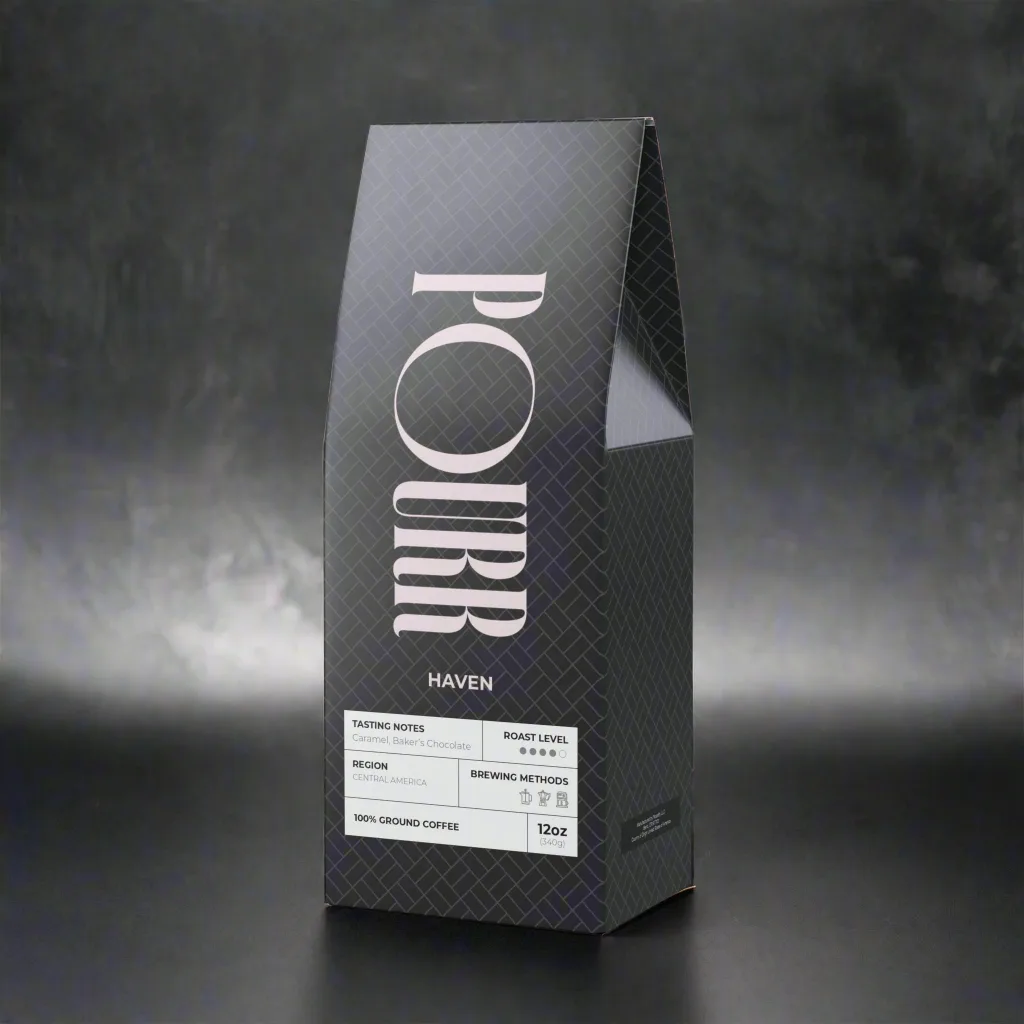
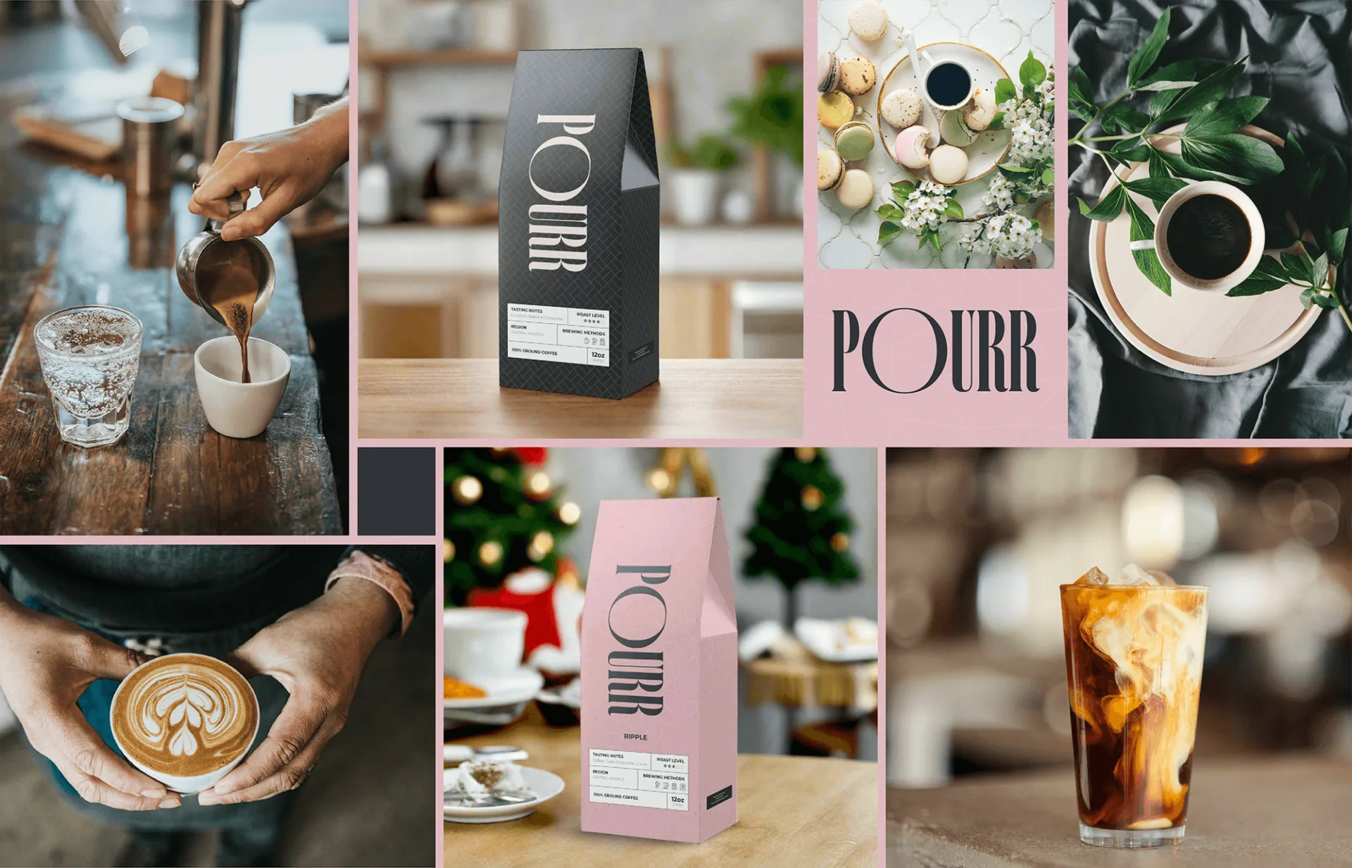
Develop product and packaging designs that reflect the premium quality of Pourr Coffee, helping the brand stand out in the market and appeal to discerning customers.
Our comprehensive approach to brand identity, UX/UI design, SEO content integration, and product/packaging design for Pourr Coffee successfully positioned them as a standout brand in the competitive coffee market. The result is a visually striking, user-friendly digital experience and a cohesive brand identity that not only resonates with their target audience but also boosts online visibility and product appeal. This strategic approach has enhanced Pourr Coffee's market presence, driving customer engagement and laying the foundation for sustained growth and success in delivering premium, sustainable coffee products.