- Meetings available in limited quantity! Don't delay your creative journey. Let's Create Together!
);}.button-group .button.-small.btn-optional{padding: 0 var(--clb-button-side-padding);min-height: var(--clb-button-height);}.site-footer .page-container{--clb-container-width:1568px;}.site-footer{background-color:#000000;background-image:url('https://shanefox.co.uk/wp-content/uploads/2024/08/Grid.png');background-position:center center;background-repeat:no-repeat;}.site-footer .widget-title{color:#ffffff;}.site-footer h6,.site-footer .widgets,.site-footer .scroll-top,.site-footer .color-switcher-item.dark,.site-footer .button,.site-footer input,.site-footer-copyright{color:#ffffff;}.site-footer a:not(.-unlink){color:#ffffff;}.site-footer-copyright{background-color:#0029ff;}.site-footer-copyright .holder{color:#ffffff;}.site-footer-copyright .holder a:not(.-unlink){color:#ffffff;}body.custom-cursor .circle-cursor-inner,body.custom-cursor .circle-cursor-inner.cursor-link-hover{background-color:#2afca5;}body.custom-cursor .circle-cursor-outer,body.custom-cursor .circle-cursor-outer.cursor-link-hover{border-color:#2afca5;}.header-wrap.page-container:not(.-full-w){--clb-container-width:1568px;}.header:not(.-sticky){background-color:rgba(10,10,10,0.01);}.header.-sticky:not(.header-8){background-color:#000000;}.header.-mobile:not(.-sticky) .hamburger-outer,.header.-mobile:not(.-sticky) .branding-title,.header.-mobile:not(.-sticky) .icon-button:not(.-overlay-button):not(.-small):not(.-extra-small),.header.-mobile:not(.-sticky) .cart-button-total a,.header.-mobile:not(.-sticky) .lang-dropdown{font-size:3rem;}.subheader{background-color:#0029ff;}.subheader,.subheader a{color:#ffffff;}.menu-optional .button-group .button{--clb-color-white:#ffffff;}.menu-optional .button-group .button:not(.page-link):not(.-dm-ignore){--clb-button-color:#0029ff;}.clb-popup.hamburger-nav{background-color:#0029ff;}.hamburger-nav .details-column:not(.social-networks),.hamburger-nav .details-column:not(.social-networks) b{color:#ffffff;}@media screen and (max-width: 768px) { .header,.slide-in-overlay{opacity: 0;}}.header.-mobile .nav .holder{background-color:#0029ff;}.header.-mobile .nav,.header.-mobile .slide-in-overlay .copyright,.header.-mobile .slide-in-overlay .lang-dropdown,.header.-mobile .slide-in-overlay .close-bar .icon-button:not(.-small){color:#ffffff;}.header.-mobile .slide-in-overlay .lang-dropdown{background-image: url("data:image/svg+xml,%3csvg xmlns='http://www.w3.org/2000/svg' viewBox='0 0 16 16'%3e%3cpath fill='none' stroke='%23ffffff' stroke-linecap='round' stroke-linejoin='round' stroke-width='2' d='M2 5l6 6 6-6'/%3e%3c/svg%3e");}.popup-subscribe .thumbnail{background-color:#000000;background-image:url('https://shanefox.co.uk/wp-content/uploads/2024/08/thrive-billboard.png.webp');background-size:cover;background-position:center center;background-repeat:no-repeat;}.popup-subscribe{background-color:#000000;}.clb-popup.subscribe-popup .close-bar .icon-button .icon,.clb-popup.subscribe-popup.-slide-in .close-bar .icon-button .icon{color:#ffffff;}.popup-subscribe .close-link{color:#ffffff;}.popup-subscribe .title{font-size:2.5rem;color:#ffffff;}.popup-subscribe p{color:#ffffff;}.notification .alert{color:#000000;}.notification .alert a{color:#0029ff;}:root{--clb-container-width:1568px;}.site-content,.page-headline:before{background-color:#000000;background-image:url('https://shanefox.co.uk/wp-content/uploads/2025/02/Group-19-1.png.webp');background-size:cover;background-position:center top;background-repeat:repeat-y;}.page-headline .bg-image{background-color:#0029ff;}.page-headline::after{background-color:rgba(0,41,255,0.75);}.page-headline .title{color:#ffffff;}.back-link:not(.light-typo):not(.dark-typo){color:#ffffff;}.breadcrumb,.filter-holder,.filter-holder select{color:#ffffff;}h1{font-size:4.75rem;}h2{font-size:3.5rem;}h3{font-size:2.25rem;}h4{font-size:1.5rem;}h5{font-size:1rem;}h6{font-size:.875rem;}@media screen and (max-width: 1440px) { :root { --clb-body-font-size:1rem; } } @media screen and (max-width: 1180px) { :root { --clb-body-font-size:.875rem; } } @media screen and (max-width: 768px) { :root { --clb-body-font-size:.875rem; } }@media screen and (max-width: 1440px) { :root { --clb-subtitles-font-size:1rem; } } @media screen and (max-width: 1180px) { :root { --clb-subtitles-font-size:1rem; } } @media screen and (max-width: 768px) { :root { --clb-subtitles-font-size:1rem; } }@media screen and (max-width: 1440px) { h1 { font-size:4.75rem; } } @media screen and (max-width: 1180px) { h1 { font-size:3.75rem; } } @media screen and (max-width: 768px) { h1 { font-size:3rem; } }@media screen and (max-width: 1440px) { h2 { font-size:3.5rem; } } @media screen and (max-width: 1180px) { h2 { font-size:3rem; } } @media screen and (max-width: 768px) { h2 { font-size:2.5rem; } }@media screen and (max-width: 1440px) { h3 { font-size:2.25rem; } } @media screen and (max-width: 1180px) { h3 { font-size:2rem; } } @media screen and (max-width: 768px) { h3 { font-size:1.75rem; } }@media screen and (max-width: 1440px) { h4 { font-size:1.5rem; } } @media screen and (max-width: 1180px) { h4 { font-size:1.25rem; } } @media screen and (max-width: 768px) { h4 { font-size:1.25rem; } }@media screen and (max-width: 1440px) { h5 { font-size:1rem; } } @media screen and (max-width: 1180px) { h5 { font-size:.875rem; } } @media screen and (max-width: 768px) { h5 { font-size:.875rem; } }@media screen and (max-width: 1440px) { h6 { font-size:.875rem; } } @media screen and (max-width: 1180px) { h6 { font-size:.875ren; } } @media screen and (max-width: 768px) { h6 { font-size:.875rem; } }.blog-item .meta-holder{color:#ffffff;}.blog-item .date{color:#2afca5;}.blog-item .post-meta-estimate{color:#ffffff;}.blog-item .title a{color:#ffffff;}.blog-item p{color:#ffffff;}.blog-item .category-holder{color:#ffffff;}.blog-item .button.-text{color:#ffffff;} @media screen and (min-width:1181px){.header-wrap .button-group{margin-right: 20px;}.blog-posts .vc_col-lg-4:last-child,.related-posts .vc_col-lg-4:last-child{display: none;}.img-shadow{filter: drop-shadow(0 0 120px rgba(0,41,255,0.75));-webkit-filter: drop-shadow(0 0 120px rgba(0,41,255,0.75));}.header:not(.-mobile) .menu li > ul{background-color: #000;border-top-width: 0px !important;border: 1px solid #333333;border-radius: 0px 0px 1.25rem 1.25rem !important;display: grid;grid-template-columns: repeat(2, 1fr);gap: .25rem;padding: .5rem !important;margin: 1rem !important;width: max(628px, 60vw);max-width: 800px;}.menu-depth-1.sub-menu .sub-menu-title{font-size: clamp(0.875rem, 0.176rem + 1.4563vw, 1.25rem);}.mega-menu-item.sub-nav-item.menu-item-depth-1 a> span{display: flex;flex-direction: row;flex-wrap: wrap;align-items: center;justify-content: flex-start;gap: .5rem;padding: 1rem;}.mega-menu-item.sub-nav-item.menu-item-depth-1 a{border: 1px solid transparent;border-radius: 1rem !important;transition: all 0.2s ease-out;}.mega-menu-item.sub-nav-item.menu-item-depth-1 a:hover{border-color: #333333;background-color: rgba(255,255,255,.02) !important;transition: all 0.2s ease-in;}.hamburger-nav-holder .mega-menu-item.sub-nav-item.menu-item-depth-1 a:hover{border: none;background-color: transparent !important;}.hamburger-nav-holder .mega-menu-item.sub-nav-item.menu-item-depth-1 a{border: none;background-color: transparent !important;}.mega-menu-item.sub-nav-item.menu-item-depth-1 a span *{order: 2;}.mega-menu-item.sub-nav-item.menu-item-depth-1 a span .custom-icon{order: 1;width: 40px;height: 40px;}.mega-menu-item.sub-nav-item.menu-item-depth-1 a span .custom-text{order: 3;font-size: clamp(0.75rem, 0.176rem + 1vw, 0.875rem); color: rgba(150,150,150,1);font-weight: 400;}body:has(.nav-item.has-submenu:hover):before{opacity: 1;z-index: 3;transition: all .2s ease-out;}body:has(.nav-item.has-submenu:hover) .header:not(.-sticky){background-color: #000;}body:has(.nav-item.has-submenu):before{content: '';height: 100vh;width: 100vw;position: fixed;z-index: -1;background-color: rgba(0,0,0,0.5);opacity: 0;backdrop-filter: blur(20px);-webkit-backdrop-filter: blur(20px);transition: all .2s ease-out;}.header:not(.-mobile) .menu li .menu-chevron{margin-left:.25rem;}.with-sticky-footer .site-footer {z-index: 0;}.site-footer .branding .logo img{min-height:40px; height:40px;}.header .branding .logo img,.header .branding .logo-mobile img,.header .branding .logo-sticky-mobile img,.header .branding .logo-dynamic img{min-height:50px; height:50px;}.header.-sticky .branding .logo img,.header.-sticky .branding .logo-mobile img,.header.-sticky .branding .logo-sticky img,.header.-sticky .branding .logo-sticky-mobile img,.header.-sticky .branding .logo-dynamic img{min-height:50px; height:50px;}:root{--clb-header-height:74px;}.header.-sticky:not(.-fixed):not(.header-8) .header-wrap{height:74px;}:root{--clb-subheader-height:20px;}.popup-subscribe{width:860px;}.page-headline{min-height:100px;}} @media screen and (min-width:769px) and (max-width:1180px){.header-wrap .button-group{margin-right: 20px;}.center-title-mob .elementor-widget-container .ohio-widget.heading.-left{display:flex;flex-direction: column;justify-content: center;align-items: center;text-align: center;}.mega-menu-item.sub-nav-item.menu-item-depth-1 a> span{display: flex;flex-direction: row;flex-wrap: wrap;align-items: center;justify-content: flex-start;gap: .5rem;padding: 1rem;}.header.-mobile .menu>.nav-item a:hover{color:#2AFCA5;transition: all var(--clb-transition-function) var(--clb-transition-duration);}.header.-mobile .menu>.nav-item a{transition: all var(--clb-transition-function) var(--clb-transition-duration);}.page-headline.subheader_included.-left{padding-bottom: 1.25rem;}.filter-holder .mobile-overlay .holder{background-color: var(--clb-fill-color) !important;}.filter-holder .mobile-overlay .holder .filter .-small{filter: brightness(200);}.img-shadow{filter: drop-shadow(0 0 80px rgba(0,41,255,0.75));-webkit-filter: drop-shadow(0 0 80px rgba(0,41,255,0.75));}div.page-headline.-full-vh {height: auto;}.type-post .entry-content{padding-top: 3rem;}.elementor-widget .ohio-widget .clb-slider-item {padding-left: 0px !important;padding-right: 0px !important;}.-sticky-element{position: initial !important;}.blog-posts-classic{grid-template-columns: repeat(2, 1fr);}.header:not(.-mobile) .menu li > ul{background-color: #000;border-top-width: 0px !important;border: 1px solid #333333;border-radius: 0px 0px 1.25rem 1.25rem !important;display: grid;grid-template-columns: repeat(2, 1fr);gap: .25rem;padding: .5rem !important;margin: 1rem !important;width: max(628px, 60vw);max-width: 800px;}.menu-depth-1.sub-menu .sub-menu-title{font-size: clamp(0.875rem, 0.176rem + 1.4563vw, 1.25rem);}.mega-menu-item.sub-nav-item.menu-item-depth-1 a> span{display: flex;flex-direction: row;flex-wrap: wrap;align-items: center;gap: .5rem;padding: 1rem;}.mega-menu-item.sub-nav-item.menu-item-depth-1 a{border: 1px solid transparent;border-radius: 1rem !important;}.mega-menu-item.sub-nav-item.menu-item-depth-1 a:hover{border-color: #333333;background-color: rgba(255,255,255,.05) !important}.mega-menu-item.sub-nav-item.menu-item-depth-1 a span *{order: 2;}.mega-menu-item.sub-nav-item.menu-item-depth-1 a span .custom-icon{order: 1;width: 40px;height: 40px;}.mega-menu-item.sub-nav-item.menu-item-depth-1 a span .custom-text{order: 3;font-size: clamp(0.75rem, 0.176rem + 1vw, 0.875rem); color: rgba(150,150,150,1);font-weight: 400;}body:has(.nav-item.has-submenu:hover):before{opacity: 1;transition: all .2s ease-out;}body:has(.nav-item.has-submenu):before{content: '';height: 100vh;width: 100vw;position: absolute;z-index: 3;background-color: rgba(0,0,0,0.5);backdrop-filter: blur(20px);-webkit-backdrop-filter: blur(20px);opacity: 0;transition: all .2s ease-out;}.slide-in .slide-in-overlay .holder, .is-mobile-menu .slide-in-overlay .holder{display: flex;flex-direction: column;justify-content: space-between;height: 100dvh;}.header.-mobile .slide-in-overlay .copyright a{font-size: .875rem !important;line-height: 1px !important;margin-bottom: 12px !important;}.header.-mobile .slide-in-overlay .copyright{line-height: 1rem !important;}.header.-mobile .slide-in-overlay .copyright h5{margin-top: 1rem;}.header.-mobile .menu li.active > a{background-color: transparent !important;color:var(--e-global-color-accent) !important;}#mobile-menu .sub-menu-title{font-size: 2rem !important;}.slide-in .slide-in-overlay .holder, .is-mobile-menu .slide-in-overlay .holder{background-color: var(--clb-selection-color);}.site-footer .branding .logo img{min-height:30px; height:30px;}.header .branding .logo img,.header .branding .logo-mobile img,.header .branding .logo-sticky-mobile img,.header .branding .logo-dynamic img{min-height:50px; height:50px;}.header.-sticky .branding .logo img,.header.-sticky .branding .logo-mobile img,.header.-sticky .branding .logo-sticky img,.header.-sticky .branding .logo-sticky-mobile img,.header.-sticky .branding .logo-dynamic img{min-height:50px; height:50px;}:root{--clb-header-height:74px;}.header.-sticky:not(.-fixed):not(.header-8) .header-wrap{height:74px;}:root{--clb-subheader-height:20px;}.page-headline{min-height:80px;}} @media screen and (max-width:768px){.header-wrap .button-group .button:not(.-outlined){display: none;}.subheader ul, .subheader ul li {flex-direction: column;}.center-title-mob .elementor-widget-container .ohio-widget.heading.-left{display:flex;flex-direction: column;justify-content: center;align-items: center;text-align: center;}.header.-mobile .menu>.nav-item a:hover{color:#2AFCA5;transition: all var(--clb-transition-function) var(--clb-transition-duration);}.header.-mobile .menu>.nav-item a{transition: all var(--clb-transition-function) var(--clb-transition-duration);}.page-headline.subheader_included.-left{padding-bottom: 1.25rem;}.is-mobile-menu .mobile-overlay .holder{display: flex;flex-direction: column;justify-content: space-between;height: 100dvh;}.filter-holder .mobile-overlay .holder{background-color: var(--clb-fill-color) !important;}.filter-holder .mobile-overlay .holder .filter .-small{filter: brightness(200);}.img-shadow{filter: drop-shadow(0 0 60px rgba(0,41,255,0.75));-webkit-filter: drop-shadow(0 0 60px rgba(0,41,255,0.75));}div.page-headline.-full-vh {height: auto;}.type-post .entry-content{padding-top: 2rem;}.elementor-widget .ohio-widget .clb-slider-item {padding-left: 0px !important;padding-right: 0px !important;}.-sticky-element{position: initial !important;}.blog-posts-classic{grid-template-columns: repeat(1, 1fr);}.mega-menu-item.sub-nav-item.menu-item-depth-1 a span .custom-icon,.mega-menu-item.sub-nav-item.menu-item-depth-1 a span .custom-text{display: none;}.slide-in .slide-in-overlay .holder, .is-mobile-menu .slide-in-overlay .holder{display: flex;flex-direction: column;justify-content: space-between;height: 100dvh;}.header.-mobile .slide-in-overlay .copyright a{font-size: .875rem !important;line-height: 1px !important;margin-bottom: 12px !important;}.header.-mobile .slide-in-overlay .copyright{line-height: 1rem !important;}.header.-mobile .slide-in-overlay .copyright h5{margin-top: 1rem;}.header.-mobile .menu li.active > a{background-color: transparent !important;color:var(--e-global-color-accent) !important;}#mobile-menu .sub-menu-title{font-size: 2rem !important;}.slide-in .slide-in-overlay .holder, .is-mobile-menu .slide-in-overlay .holder{background-color: var(--clb-selection-color);}body:has(.page-headline) .site-content{background-position: 0px 180px !important;}body:has(.page-headline) .header:not(.-sticky){background-color: rgba(0,0,0,1);}.site-footer .branding .logo img{min-height:30px; height:30px;}.header .branding .logo img,.header .branding .logo-mobile img,.header .branding .logo-sticky-mobile img,.header .branding .logo-dynamic img{min-height:50px; height:50px;}.header.-sticky .branding .logo img,.header.-sticky .branding .logo-mobile img,.header.-sticky .branding .logo-sticky img,.header.-sticky .branding .logo-sticky-mobile img,.header.-sticky .branding .logo-dynamic img{min-height:50px; height:50px;}:root{--clb-header-height:74px;}.header.-sticky:not(.-fixed):not(.header-8) .header-wrap{height:74px;}:root{--clb-subheader-height:20px;}.page-headline{min-height:60px;}}
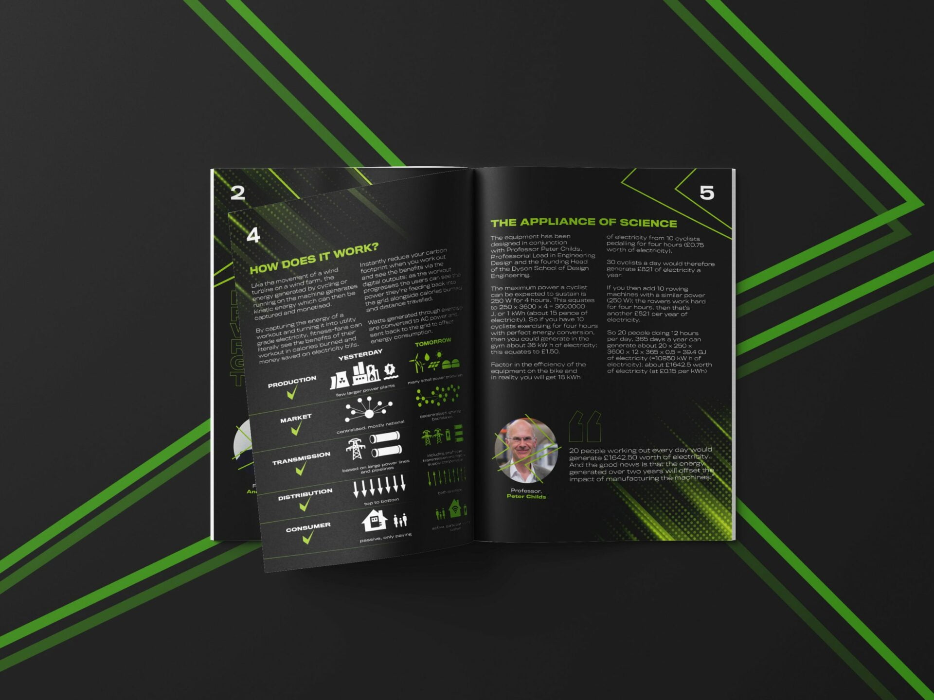
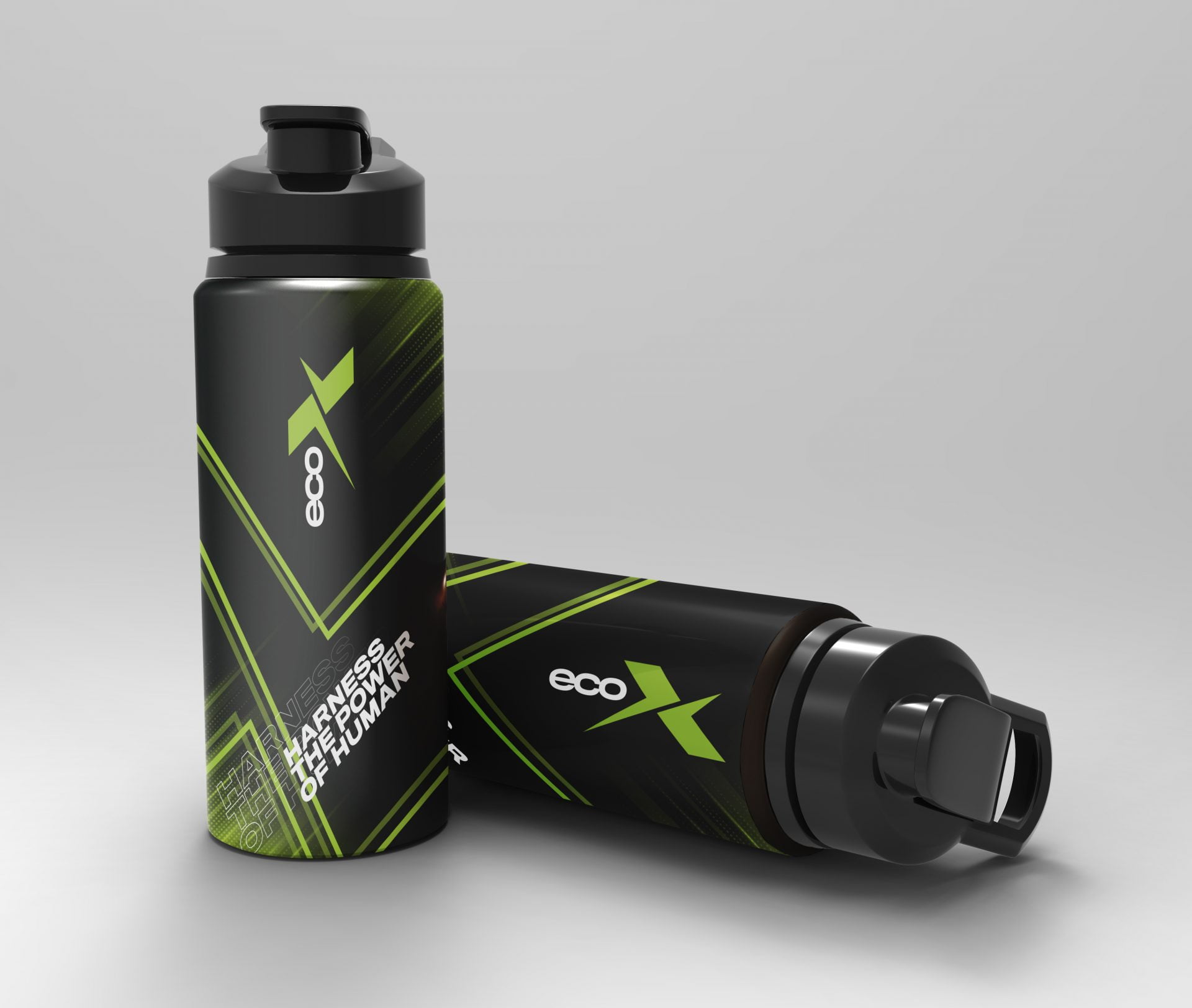
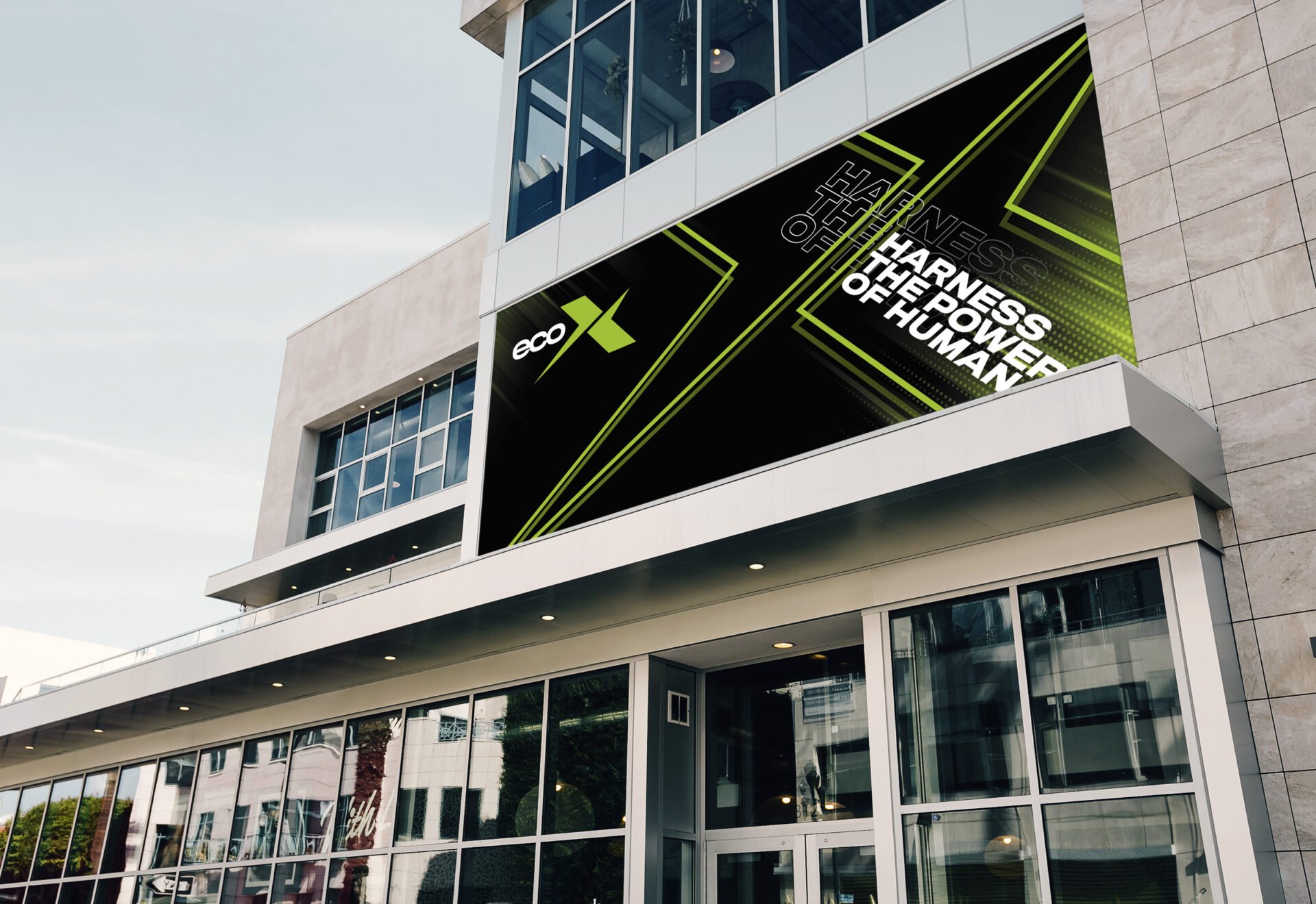
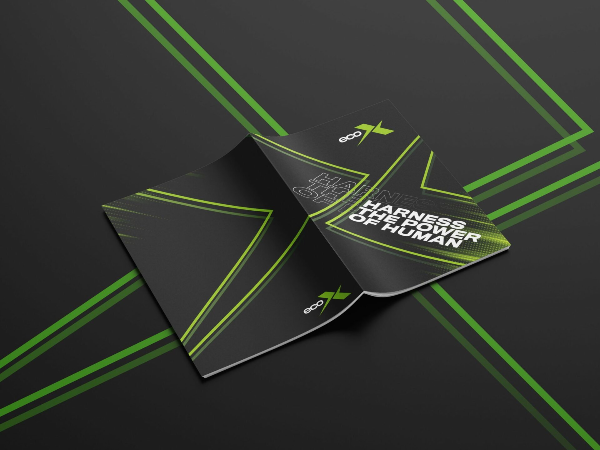
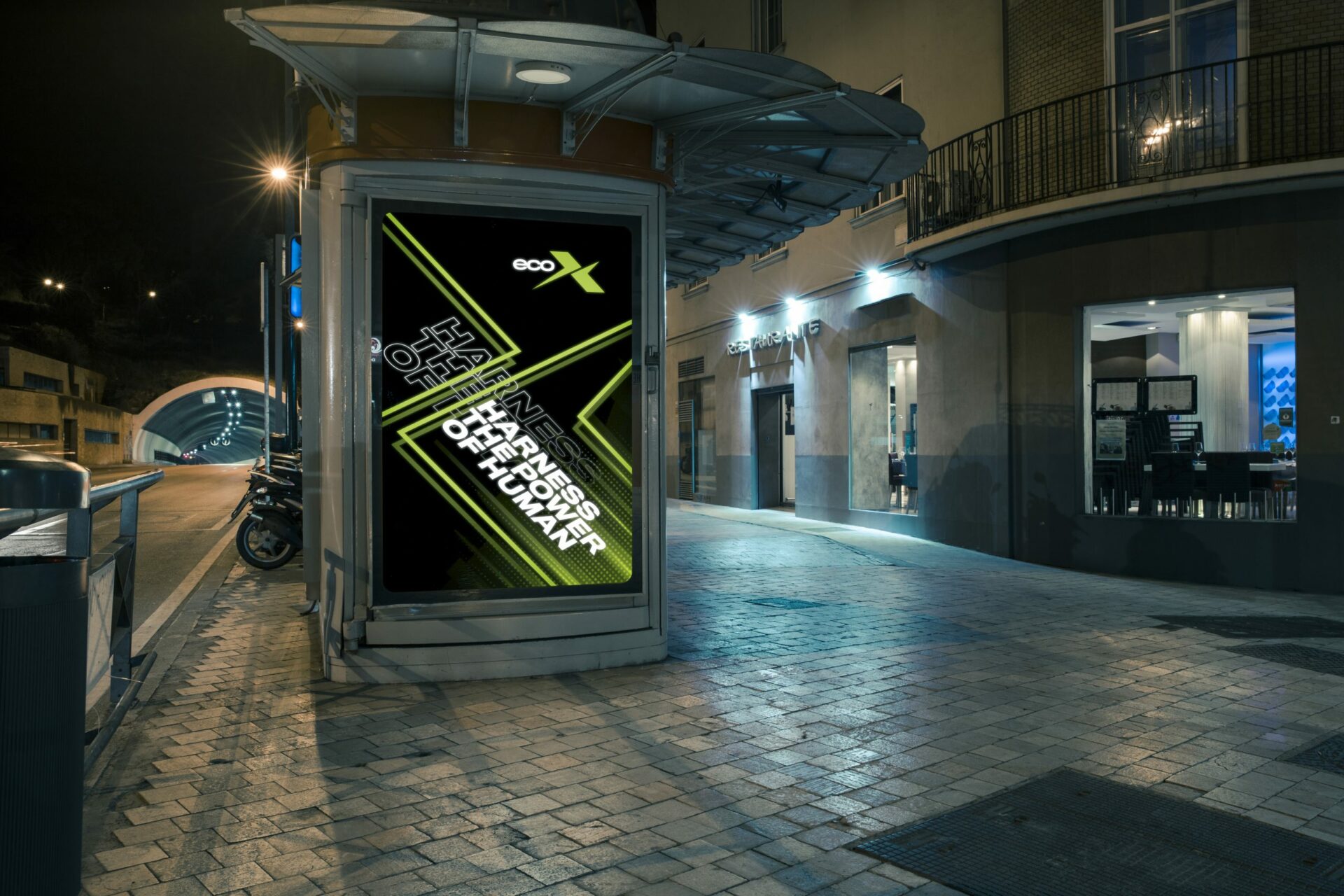
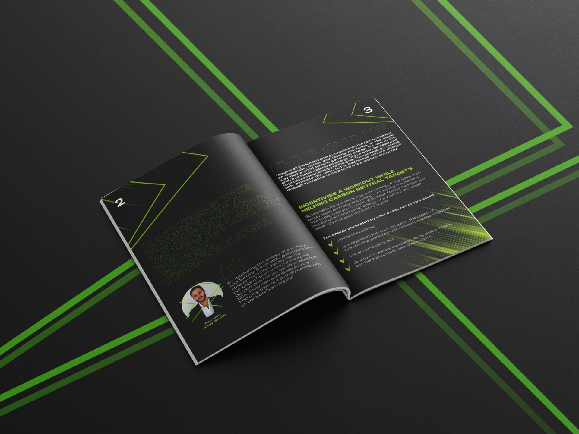
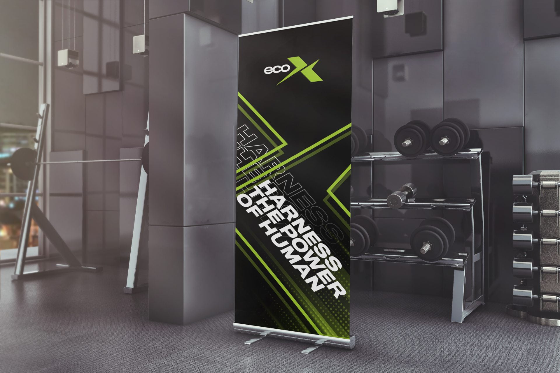
ecoX, a sustainable fitness company focused on eco-friendly practices and holistic wellness, approached us to create a unique brand identity and digital experience that would resonate with their environmentally-conscious audience. The challenge was to design a brand that not only reflects their commitment to sustainability but also appeals to a growing community of fitness enthusiasts who value both health and environmental impact. Our task included crafting a distinctive logo, cohesive brand identity, intuitive UX/UI design, and dynamic motion design.
Develop a distinctive logo and brand identity that embodies ecoX’s commitment to sustainability and wellness.
Design an intuitive and engaging website and mobile app interface that enhances user experience and supports community building.
Integrate motion design to create an interactive and motivating digital experience for users.
Ensure consistent visual branding across all digital and physical touchpoints, from the website to in-gym displays.
Our comprehensive approach to logo design, brand identity, UX/UI design, and motion design for ecoX successfully positioned them as a standout brand in the fitness industry. The result is a visually cohesive, highly engaging digital platform that not only attracts a loyal customer base but also drives significant growth in both memberships and product sales, aligning with ecoX’s mission to promote health and sustainability.